
1. Euphoria Logo Contest, will you participate?
- Posted by jeremy (admin) Aug 06, 2009
- 85863 views
Euphoria is in need of a new logo. Do we have any members on the forum that are graphic artists willing to participate that can create a professional quality logo for Euphoria?
Jeremy
2. Re: Euphoria Logo Contest, will you participate?
- Posted by shfrance Aug 07, 2009
- 85813 views
I'm not professing to be a professional. My question is...
As briefly as possible, could you describe the main differences from the previous release?
This is an attempt at stirring some inspiration.
3. Re: Euphoria Logo Contest, will you participate?
- Posted by jeremy (admin) Aug 07, 2009
- 85818 views
Hm, that's a big question! It needs to be addressed in the manual, so it'll be done sometime before 4.0b2 I hope, but for sure before final release.
Does anyone want to take a stab at what is new in 4.0?
Jeremy
4. Re: Euphoria Logo Contest, will you participate?
- Posted by jeremy (admin) Aug 07, 2009
- 85806 views
Euphoria is in need of a new logo. Do we have any members on the forum that are graphic artists willing to participate that can create a professional quality logo for Euphoria?
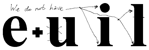
I do have two ideas... The second I like better...
- A big, capital curvy E with the bottom looping up to be a lower case "u". The lower case "u" would would be the bottom part of a smiley face ... Thus, it vaguely looks like Eu but the "u" being a smiley face, i.e. Euphoric.
- A box that has been opened and coming out of the box is the top part of a textual style smiley face. i.e. "Open" (as in the box) Euphoria (as in the smiley)
Jeremy
5. Re: Euphoria Logo Contest, will you participate?
- Posted by euphoric (admin) Aug 07, 2009
- 85793 views
i.e. Euphoric.
Yes?
6. Re: Euphoria Logo Contest, will you participate?
- Posted by jeremy (admin) Aug 07, 2009
- 85805 views
3. An open box with Eu coming out of it, the u bing a textual smiley face.
Jeremy
7. Re: Euphoria Logo Contest, will you participate?
- Posted by shfrance Aug 07, 2009
- 85794 views
I hadn't gotten that far. I was still morphing what there is.
The 32x32 icon has an E with a checkerboard pattern. To me that signifies the "spotty" collection of commands (compared to a full language) from the previous version.
To signify a full, but still procedural language, I was thinking of a horizontal striped pattern of some kind.
I had also mused about when Eu goes OOP, the icon could be Capital E lower case e.
8. Re: Euphoria Logo Contest, will you participate?
- Posted by jeremy (admin) Aug 07, 2009
- 85790 views
I was thinking more along the lines of a logo, not really an icon. An icon for Euphoria will be used rarely. The logo could be converted into an icon, of course.
Jeremy
9. Re: Euphoria Logo Contest, will you participate?
- Posted by Jerry_Story Aug 07, 2009
- 85810 views
Euphoria is in need of a new logo.
What is wrong with the logo that Euphoria has now?
10. Re: Euphoria Logo Contest, will you participate?
- Posted by shfrance Aug 07, 2009
- 85793 views
An icon for Euphoria will be used rarely.
Only every executable file in a folder.
Nevertheless, perhaps you are thinking of a watermark.
A logo would only be used on the main website page and in the language publication.
11. Re: Euphoria Logo Contest, will you participate?
- Posted by jeremy (admin) Aug 07, 2009
- 85746 views
- Last edited Aug 08, 2009
It actually would only be part of the euiw.exe, as it's the only true Windows program? Then, on all of the Unix variants (which include Linux, OS X, FreeBSD, NetBSD, OpenBSD, SunOS) there would be no icon for any of them.
Now, on the windows side of things, the .e, .ex, .exd, .exw source files would benefit from an icon, but that's really benefiting only developers as most end users will be downloading a pre-compiled package, presumably with it's own icon defined (at least that's how it should be).
Jeremy
12. Re: Euphoria Logo Contest, will you participate?
- Posted by DerekParnell (admin) Aug 07, 2009
- 85758 views
- Last edited Aug 08, 2009
Euphoria is in need of a new logo.
CAUTION: I have no skill in this field.
I feel that a logo needs to avoid being too "comic"-like , and "cute" is not really a priority either.
The "open" metaphor might be manifested as an opened door or window with the "euphoria" concept as a rainbow coloured "smiley" peeking out.
I've also envisaged some mythical creature emerging from a rainbow coloured chrysalis, maybe a gryphon or dragon?
13. Re: Euphoria Logo Contest, will you participate?
- Posted by useless Aug 08, 2009
- 85762 views
Euphoria is in need of a new logo.
CAUTION: I have no skill in this field.
I feel that a logo needs to avoid being too "comic"-like , and "cute" is not really a priority either.
The "open" metaphor might be manifested as an opened door or window with the "euphoria" concept as a rainbow coloured "smiley" peeking out.
I've also envisaged some mythical creature emerging from a rainbow coloured chrysalis, maybe a gryphon or dragon?
I was afraid you were going to say Euphoronid. Phoronids aren't imposing.
Hmmm: EU PHORIA(ユーフォーリア, YÅ«fÅria)is a Japanese all girl band, formed in 2002. They are being released under Avex's label SONIC ...
I'm not enthusiastic about the rainbow coloring.
kat
14. Re: Euphoria Logo Contest, will you participate?
- Posted by jeremy (admin) Aug 08, 2009
- 85781 views
I'm not enthusiastic about the rainbow coloring.
Nor am I.
Jeremy
15. Re: Euphoria Logo Contest, will you participate?
- Posted by DerekParnell (admin) Aug 08, 2009
- 85807 views
I'm not enthusiastic about the rainbow coloring.
Nor am I.
Jeremy
Right, so its definitely in then 
Given free rein, I'd actually like a surfing metaphor - but at least I'm throwing out ideas for people to bounce off.
16. Re: Euphoria Logo Contest, will you participate?
- Posted by jeremy (admin) Aug 08, 2009
- 85804 views
My idea for this thread was not to define what the logo should be but to give ideas to encourage the creative people on the forum to come up with ideas and present logos. Who really knows what a logo will look like until they see it. That's the problem and for me personally, I'm not at all graphically creative.
Jeremy
17. Re: Euphoria Logo Contest, will you participate?
- Posted by Tom Aug 09, 2009
- 85813 views
A starting point...
18. Re: Euphoria Logo Contest, will you participate?
- Posted by jeremy (admin) Aug 09, 2009
- 85753 views
Tom, I like the first one better, the Eu, but it seems a bit hard to recognize the E as an E?
Jeremy
19. Re: Euphoria Logo Contest, will you participate?
- Posted by doncole2009 Aug 10, 2009
- 85759 views
Not being a pro. I like the wire.ex demo caught in mid air.
Don Cole
20. Re: Euphoria Logo Contest, will you participate?
- Posted by SunPsych08 Sep 06, 2009
- 85642 views
Hello everyone...
I've submitted to RDS a zipped pdf file containing sample logos for people to look at. They were designed by Ms Gina Stephens (Graphic Artist [Victoria, Australia]) from a couple of basic ideas of mine. We wanted the logos to suggest various attributes of Euphoria: bright, crisp, uncluttered; simple (but not "simplistic"); speed; higher-level; sequence (viz { } ); slice (viz [ ... ] ); procedure/function (viz ( ) ).
Comments anyone?
Alex Caracatsanis
21. Re: Euphoria Logo Contest, will you participate?
- Posted by jeremy (admin) Sep 06, 2009
- 85617 views
I've submitted to RDS a zipped pdf file containing sample logos for people to look at.
Alex,
Seems it's not online yet. When it comes online, I'll certainly give you feedback.
Jeremy
22. Re: Euphoria Logo Contest, will you participate?
- Posted by jeremy (admin) Sep 06, 2009
- 85572 views
Comments anyone?
Alex,
I'd like to put these logos on a web page, numbered just as you have them, but something people can just view. I would also like to put the other submitted logos on the same page with a number, then we can begin to comment on each logo with each number.
Can you email me the logo's in a png/jpeg format at a sensible size? Or, if it is easier, if you host the png/jpeg's. You're call. We can link to many different places on the wiki.
Jeremy
23. Re: Euphoria Logo Contest, will you participate?
- Posted by jeremy (admin) Sep 06, 2009
- 85591 views
I've submitted to RDS a zipped pdf file containing sample logos for people to look at. They were designed by Ms Gina Stephens (Graphic Artist [Victoria, Australia]) from a couple of basic ideas of mine. We wanted the logos to suggest various attributes of Euphoria: bright, crisp, uncluttered; simple (but not "simplistic"); speed; higher-level; sequence (viz { } ); slice (viz [ ... ] ); procedure/function (viz ( ) ).
Alex,
Is Ms. Gina Stephens willing to donate one of the Logo's for our use?
Also, I'll start with my comments on these logos.
- I don't care for the boxy outline of #1, #2, #3 and #5.
- I really like #4 as it looks like it will fit right into many forms of documentation.
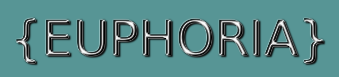
- I love the use of { ... } as a sequence is one of the main powerhouses of Euphoria.
- I really like the O in #6 and #7, I think the colors of #7 a bit better.
- I don't care for the ( ) in #8 as much as the { } in others.
- #9 contains a large area of graphics that would make a lot of white space elsewhere when put on a web page or in docs.
- The E style in #10, #12, #27, #28, #30 and #31 seem too much like the E logo of Internet Explorer.
- #11 is nice, but it doesn't seem to catch me as much as #4, #6 or #7.
- #13, #14, #15, #16, #17, #18 remind me of a laundry detergent logo for some reason.
- #15 doesn't have enough colors
- #16 isn't as nice as the others of it's type that has the sun burst in the background
- Of the circular types, #13-#20, I think I like #18 the best, but I can't explain why

- #21, #22, I like the { } too much to like these ones better than the others with { }
- Hm, there are 2 #21's and #22's, opps.
- 2nd #21, #22 and #23, I don't like how the { ... } breaks up the Euphoria word.
- #24, #25, #26 and #29 I'm just not a fan of any of those E's.
- #27, #28, #30 and #31 all have the "IE" E that I mentioned earlier.
- #32 I think is too tall for the actual font height that says what it is.
- #33 and #34 are not as exciting as the others.
- #35 is too much vertical space for the logo vs. the text.
Overall? It's very hard to pick which would be my favorite. I can eliminate many, which is what I did in my above list. I'll be interested in hearing other peoples comments.
Jeremy
24. Re: Euphoria Logo Contest, will you participate?
- Posted by ChrisB (moderator) Sep 06, 2009
- 85580 views
Hi
I Like the circled ones best, but have little preference between them. Al would translate to an icon nicely.
Put them on a web page, with a polling vote, eliminating losers and restarting the vote every few days - after a week or 2 tou will have the new logo.
Chris
25. Re: Euphoria Logo Contest, will you participate?
- Posted by euphoric (admin) Sep 06, 2009
- 85589 views
Euphoria is in need of a new logo. Do we have any members on the forum that are graphic artists willing to participate that can create a professional quality logo for Euphoria?
Here's some ideas. Refer to likes/dislikes by {row,column} or by filename. Many of these are amenable as to color and font style so feel free to make suggestions.
26. Re: Euphoria Logo Contest, will you participate?
- Posted by mattlewis (admin) Sep 06, 2009
- 85579 views
Here's some ideas. Refer to likes/dislikes by {row,column} or by filename. Many of these are amenable as to color and font style so feel free to make suggestions.
The diagonal, capital Es (row 2, cols 4-7) look a lot like the Dell logo.
Matt
27. Re: Euphoria Logo Contest, will you participate?
- Posted by euphoric (admin) Sep 06, 2009
- 85573 views
Here's some ideas. Refer to likes/dislikes by {row,column} or by filename. Many of these are amenable as to color and font style so feel free to make suggestions.
The diagonal, capital Es (row 2, cols 4-7) look a lot like the Dell logo.
I had to dodge Enron's logo too. So I guess no rotated capital E. 
28. Re: Euphoria Logo Contest, will you participate?
- Posted by ssallen Sep 06, 2009
- 85768 views
They are all pretty good but I think 7 & 9 are best. The rest remind me too much of laundry detergent logos.
http://www.tide.com/en-US/index.jspx?gclid=CKSD_onx3ZwCFR0Sagod8hsoKA http://www.ilovegain.com/home.do http://www.glad.com/
It thinks its all the ovals and parallelograms.
29. Re: Euphoria Logo Contest, will you participate?
- Posted by SunPsych08 Sep 06, 2009
- 85532 views
Comments anyone?
Can you email me the logo's in a png/jpeg format at a sensible size?
Sure Jeremy; can do. I'm not au fait with "sizing" these images. If you tell me what is a "sensible size", I'll ask Gina to resize them. Once done, where should I send them?
Alex Caracatsanis
30. Re: Euphoria Logo Contest, will you participate?
- Posted by SunPsych08 Sep 06, 2009
- 85500 views
I've submitted to RDS a zipped pdf file containing sample logos for people to look at.
Is Ms. Gina Stephens willing to donate one of the Logo's for our use?
Yes. I'm paying her for her work. She'll do what the Eu community wants: modify the samples; design new ones; receive ideas directly from someone on behalf of the community... There's no obligation to use her, of course. I just wanted to put some concrete ideas out there for people to consider. If we do decide to use her I'll pay her fee - and that'll be my contribution to Euphoria, like others have contributed so much time/effort getting us to this point. Again, no obligation.
Alex Caracatsanis
31. Re: Euphoria Logo Contest, will you participate?
- Posted by ryanj Sep 06, 2009
- 85483 views
- Last edited Sep 07, 2009
The rest remind me too much of laundry detergent logos.
LOL, that's the first thing i thought when i saw them.
32. Re: Euphoria Logo Contest, will you participate?
- Posted by jeremy (admin) Sep 06, 2009
- 85520 views
- Last edited Sep 07, 2009
The rest remind me too much of laundry detergent logos.
LOL, that's the first thing i thought when i saw them.
Well, this is the third person, so it seems a batch of them are out (at least by the responses thus far).
Which one's did you like or did you not like any of them? Don't forget, there are others submitted in this thread also.
Jeremy
33. Re: Euphoria Logo Contest, will you participate?
- Posted by ryanj Sep 06, 2009
- 85487 views
- Last edited Sep 07, 2009
The rest remind me too much of laundry detergent logos.
LOL, that's the first thing i thought when i saw them.
Well, this is the third person, so it seems a batch of them are out (at least by the responses thus far).
Which one's did you like or did you not like any of them? Don't forget, there are others submitted in this thread also.
Jeremy
I like the style of most of them- they are creative, i just don't know if they are good for a programming language. However something like 6, 7, 8, 9, or 11 might work. I also like more of a rectangle than an ellipse.
34. Re: Euphoria Logo Contest, will you participate?
- Posted by jeremy (admin) Sep 06, 2009
- 85473 views
- Last edited Sep 07, 2009
I like the style of most of them- they are creative, i just don't know if they are good for a programming language. However something like 6, 7, 8, 9, or 11 might work. I also like more of a rectangle than an ellipse.
To keep the conversation going, why are they not suited for a programming language and what would you change to make them suitable for a programming language or what would you suggest?
Jeremy
35. Re: Euphoria Logo Contest, will you participate?
- Posted by ryanj Sep 06, 2009
- 85490 views
- Last edited Sep 07, 2009
I like the style of most of them- they are creative, i just don't know if they are good for a programming language. However something like 6, 7, 8, 9, or 11 might work. I also like more of a rectangle than an ellipse.
To keep the conversation going, why are they not suited for a programming language and what would you change to make them suitable for a programming language or what would you suggest?
Jeremy
Actually, i think it's just the shape that i don't like. Perhaps use a rectangle with rounded corners, or not even a defined shape. I do like the rays of light and curvey streaks of color, just not the obvious ellipse border. Perhaps just put fancy text on top of a curve or two and rays of light. One nice thing about rays of light is that they could be angled in a way to allow them to be extended across a web page to make a cool background for the top banner and the left side or body of the page.
36. Re: Euphoria Logo Contest, will you participate?
- Posted by ryanj Sep 06, 2009
- 85471 views
- Last edited Sep 07, 2009
I'm assuming this logo would be used on the website, correct? As far as an icon for euphoria, i think a simple {e} or {eu} in the same color scheme and font as the logo would be nice.
37. Re: Euphoria Logo Contest, will you participate?
- Posted by ryanj Sep 06, 2009
- 85493 views
- Last edited Sep 07, 2009
Another thought i had...maybe a box or can laying on it's side with the top open, with rays of light and the words "open euphoria" coming out of it? It could represent euphoria getting "out of the box" and released to the world as open source. Someone mentioned something like this before, and i liked that idea.
38. Re: Euphoria Logo Contest, will you participate?
- Posted by jeremy (admin) Sep 06, 2009
- 85489 views
- Last edited Sep 07, 2009
I'm assuming this logo would be used on the website, correct? As far as an icon for euphoria, i think a simple {e} or {eu} in the same color scheme and font as the logo would be nice.
The logo would be used for the website, documentation html, pdf, etc...
Jeremy
39. Re: Euphoria Logo Contest, will you participate?
- Posted by prickle Sep 07, 2009
- 85480 views
I think Gina's logos are very well made, despite the fact that blue sunbursts appear to be a signature mark for laundry detergents.
My personal favourite is #6, I love the "o" although might I suggest removing the square brackets and periods from "open", it makes it look optional to me.
Euphoric's logos have potential as icons (the ones that don't immediately resemble existing company logos) but convey less meaning. An outsider would not know from looking what the logo represents without extra explanations, and I think this is important.
Now for my two cents. It's vaguely relevant. Uninterested readers turn away now. What follows is all my own worthless opinion but I put it forward anyway for your consideration.
Why I think Euphoria never did as well as it deserves: It's the name people! "Euphoria" sounds to me like someone is trying really hard to sell something. It has it's roots in the original commercial release where I think it worked well. The open community seems to regard it with some suspicion though, a humorous or technically clever name might be much more appropriate and suitable.
The other problem with "Euphoria" I see is as a name it is too easily overlooked, forgotten or otherwise makes less of an impression than it should. A name that is a unique word and promotes a moment's thought somehow by being clever or funny should make it stick in the mind and may promote more "Oh, I remember that.." moments for people.
Now I am terrible with names and can only offer criticism not suggestions but I really needed to get this off my chest. Phew.
Cheers, Nick.
40. Re: Euphoria Logo Contest, will you participate?
- Posted by euphoric (admin) Sep 07, 2009
- 85456 views
Euphoric's logos have potential as icons (the ones that don't immediately resemble existing company logos) but convey less meaning. An outsider would not know from looking what the logo represents without extra explanations, and I think this is important.
This can be said of many well-known logos.
The term "OpenEuphoria" is obviously what and who we are, and will be featured on the web site. But it is important that we find an iconic image that over time and much exposure has people thinking, "Euphoria," without any prompting from us (other than the icon itself).
It's the name people!
Yeah, I'm going to keep pushing the name "TooL." Regardless, a one-syllable name seems appropriate in this day and age.
41. Re: Euphoria Logo Contest, will you participate?
- Posted by useless Sep 07, 2009
- 85455 views
Is the "open" part required?
There's tons of open source code bases out that do not include "open" in their name. If "open" is required, perhaps some sort of Eu syntax juxtapositioning the two words.
I am partial to 6 and 7, and would like to see more variations on that, mostly using Eu's []{}.. in the logo, perhaps meaningfully. I'd lose the ovals and circles and long swooshes. Not liking the elongated lower horizontal on the 'E' in 1..5.
There's a number of languages that use an abbreviation or an acronym, or a partial of either, like we use "Eu". Like i use "Euphorum". Perhaps it's time to retire the dubious RDS reason for calling the language "euphoria". Just an idea, it's nearly 2010.
useless
42. Re: Euphoria Logo Contest, will you participate?
- Posted by kinz Sep 07, 2009
- 85478 views
Well, I'd like to propose some hieroglyph for the Open Euphoria logo.
For example:
http://pl-euphoria.narod.ru/oeu.jpg
Regards, kinz
43. Re: Euphoria Logo Contest, will you participate?
- Posted by jaygade Sep 11, 2009
- 85277 views
After browsing some of these...
For websites and such, I like Gina's logos especially numbers 7, 11, and 32.
For icons, I like both Igor's submissions to the archive and euphoric's simple ideas, especially row one column one which just looks like a green {e} on a black background.
44. Re: Euphoria Logo Contest, will you participate?
- Posted by euphoric (admin) Sep 11, 2009
- 85293 views
...euphoric's simple ideas, especially row one column one which just looks like a green {e} on a black background.
I liked the concept of including brackets in the logo, as they allude to sequences, one of Euphoria's unique elements and strengths. The green on black looks like a programmer's console, so it works well IMHO.
I don't like any of Gina's logos for our purposes. IMHO, they are not simple enough, some of the design elements don't work (the square brackets), and the coloring is not to my tastes. If we're going to have a large logo for the web site, we'd need to see the corresponding icon as well that matches the design.
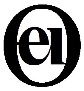
Igor's logos look like they contain "ei," which I can't translate. However, I like their simplicity and think they would work well as both an icon and a logo.
As examples of logo/icon design simplicity, see the following:
etc...
45. Re: Euphoria Logo Contest, will you participate?
- Posted by jeremy (admin) Sep 11, 2009
- 85272 views
I don't like any of Gina's logos for our purposes. IMHO, they are not simple enough, some of the design elements don't work (the square brackets), and the coloring is not to my tastes. If we're going to have a large logo for the web site, we'd need to see the corresponding icon as well that matches the design.
Hm. I understand what you're saying but I'm not sure we should shoot for an all inclusive logo? An icon will be used rarely, the logo will be displayed everywhere.
Jeremy
46. Re: Euphoria Logo Contest, will you participate?
- Posted by _tom (admin) Sep 11, 2009
- 85203 views
A few more choices...


Tom
47. Re: Euphoria Logo Contest, will you participate?
- Posted by Critic Sep 11, 2009
- 85191 views
I like the rainbow icons RDS uses.
48. Re: Euphoria Logo Contest, will you participate?
- Posted by euphoric (admin) Sep 11, 2009
- 85228 views
I'm not sure we should shoot for an all inclusive logo? An icon will be used rarely, the logo will be displayed everywhere.
The icon will be displayed whenever you see Euphoria source, or maybe an executable for which you don't use a custom icon. I don't know about you, but I see the current Euphoria icon everywhere!
And a logo that can function as an icon is far more versatile. It goes on hats, pens, golf balls, stationary, shirts, avatars, desktops.
So, yes... we should shoot for a logo that can also serve as an icon. You can always expand on the idea. For example, say we choose the {e} icon. Then, for the web site, you can "expand" it into a web logo and make it {euphoria}. That's somewhat adhering to what I mean where the logo and icon should be stylized the same.
Anyway, look again at the examples I provided of other logos/icons. They are simple, eye-catching, and have a "tech" feel. I don't want to see something flowery or colorful for a Euphoria icon/logo. The perception should be one of technology/programming/science.
49. Re: Euphoria Logo Contest, will you participate?
- Posted by jeremy (admin) Sep 11, 2009
- 85202 views
The icon will be displayed whenever you see Euphoria source, or maybe an executable for which you don't use a custom icon. I don't know about you, but I see the current Euphoria icon everywhere!
Really!? I see whatever editor the file is associated with. The only time I see the Icon is when I run a program via euiw.exe
And a logo that can function as an icon is far more versatile. It goes on hats, pens, golf balls, stationary, shirts, avatars, desktops.
And the ones presented cannot go on any of those item? Of course they can. Well, maybe not pens or golf balls.
So, yes... we should shoot for a logo that can also serve as an icon.
You have not convinced me.
You can always expand on the idea. For example, say we choose the {e} icon. Then, for the web site, you can "expand" it into a web logo and make it {euphoria}. That's somewhat adhering to what I mean where the logo and icon should be stylized the same.
How is that any different than using some of the ones that many of the others like that use { } and OpenEuphoria? Also, with just the plain e logos, the first thing I think of is Eiffel, as it has a larger user base.
Anyway, look again at the examples I provided of other logos/icons. They are simple, eye-catching, and have a "tech" feel. I don't want to see something flowery or colorful for a Euphoria icon/logo. The perception should be one of technology/programming/science.
How is a ruby technical? or the Python logo? None of them are technical. The { Open... Euphoria } logos are far more technical than the others you used as examples. About eye-catching, I don't want to make anyone feel bad but they look like they were done by an amateur, they just have that feel to them. Now, please don't take that the wrong way! I'm just trying to portray my thoughts on the subject. You don't see any logos submitted by me because I know I couldn't come close to doing something like any of the submitted logos.
Jeremy
50. Re: Euphoria Logo Contest, will you participate?
- Posted by euphoric (admin) Sep 11, 2009
- 85204 views
I see whatever editor the file is associated with. The only time I see the Icon is when I run a program via euiw.exe
You make the editor the program that opens your source files. I keep the interpreter as the main program. I wonder how most people do it.
a-ha! New idea for euWeb: SURVEYS!
You can always expand on the idea. For example, say we choose the {e} icon. Then, for the web site, you can "expand" it into a web logo and make it {euphoria}. That's somewhat adhering to what I mean where the logo and icon should be stylized the same.
How is that any different than using some of the ones that many of the others like that use { } and OpenEuphoria?
It's not different and I didn't say it was. The problem is, we haven't seen icons for any of those logo ideas. I was just suggesting that some be made.
Also, with just the plain e logos, the first thing I think of is Eiffel, as it has a larger user base.
So? When I see "EU," I think "European Union."
It is probably a rare Euphorian who even knows that Eiffel is a programming language and not a tower in Paris.
It's going to be a rare logo that doesn't confuse somebody.
Anyway, look again at the examples I provided of other logos/icons. They are simple, eye-catching, and have a "tech" feel. I don't want to see something flowery or colorful for a Euphoria icon/logo. The perception should be one of technology/programming/science.
How is a ruby technical?
It's compact, simple, and eye-catching. Maybe it doesn't match "technical." 3 out of 4 is good.
or the Python logo?
If you don't know the difference between a technical feel and a not-technical feel, I don't think my words are going to help.
My primary concern is this: I don't want to see something flowery or colorful for a Euphoria icon/logo. I know that sentiment is shared by others. But not Critic. He likes the rainbow.
The { Open... Euphoria } logos are far more technical than the others you used as examples.
Cut down on the flowery coloring and many of them just might work fine!
I'm just trying to portray my thoughts on the subject.
Thanks. Me too.
51. Re: Euphoria Logo Contest, will you participate?
- Posted by kinz Sep 12, 2009
- 85230 views
Igor's logos look like they contain "ei," which I can't translate.
The idea under this logo is to combine 'e' and 'u', and you can see the pure part of 'e', the common part of 'e' and 'u' and pure part of 'u'. See please once more this combined letter, 'eu'. It is not like to 'i', 'i' has very important dot on its top.
Then, this combined new letter 'eu' can be very easily transformed to Russian letter, which sounds as 'u', same as English 'eu'. To make this transforming, just see on English logo in mirror.

And if you turn this English logo to 180 degrees, you get the first letter of Russian translation of the 'Euphoria' word.
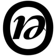
So, this logo has some interesting 'secret' properties. See please more variants of this logo-icon.

Regards, kinz
52. Re: Euphoria Logo Contest, will you participate?
- Posted by SunPsych08 Sep 12, 2009
- 85159 views
Euphoria is in need of a new logo. Do we have any members on the forum that are graphic artists willing to participate that can create a professional quality logo for Euphoria?
Jeremy
I don't have a personal desire to promote Gina's work (she only implemented some fuzzy ideas I had for a logo); she's not a programmer; she wasn't sure whether we were looking for a symbol, an icon, an image for the website, or whatever... But she's a professional graphic artist, and she was genuinely interested in lending a hand at no cost to the general Euphoria community.
Perhaps we could do something like this:
- list the various design criteria we're discussing here
- elect one of our more "senior" Euphorians to represent us collectively
- let him/her contact Gina and discuss what we're looking for
- ask her to send us some samples based on our preferences
- display everyone's submissions on a single site
- evaluate each submission against our initial criteria
- vote for the winning entry
Alex Caracatsanis
PS: I'm automatically excluded from representing Euphorians: I'm beyond "senior"(actually, "senescent"); I haven't ventured beyond the console; I had to look up "logo" in the dictionary. But I can give you Gina's email, if you want it.
53. Re: Euphoria Logo Contest, will you participate?
- Posted by kinz Sep 14, 2009
- 85098 views
The idea about combination of 'e' and 'u' for Open Euphoria logo seems to be productive ...
See please one more example:
![]()
Regards,
kinz
54. Re: Euphoria Logo Contest, will you participate?
- Posted by DanM Sep 14, 2009
- 85042 views
The idea about combination of 'e' and 'u' for Open Euphoria logo seems to be productive ...
See please one more example:
![]()
Regards,
kinz
I think that's VERY nice!
Could I suggest you alter it something like this?
(with apologies for mangling your very nicely done art!)

I'm not an artist, so I couldn't modify your's as well as your original, the points are:
make the "U" look more like a "u"
would need a thicker "O" to accomodate a more properly extended portion for the "u"
"..pen" would have to be a little lower
and "..phoria" might have to be a little higher
just a thought.
Dan
55. Re: Euphoria Logo Contest, will you participate?
- Posted by useless Sep 14, 2009
- 85043 views
I don't see anything *wrong* with kinz's design (other than "where's the 'u' ?"), i am at the other end of the pendulum swing from flowery-artistic and the RDS logo. I'd prefer something technical, to set it in a camp far from the various connotations the Eu logo has now, and separate from the European Union. Not that i want the 1970's sans serif all caps blocks of letters designs for programming languages either.
Regardless of the various ways one could manipulate an image to be cyrilic characters, or cute origami, i think the 'E' and 'u' should be distinct and readable. If someone goes to google the letters in the logo, you want them to find EUphoria, no?
Since Euphoria has been "open" only a year, i do not believe "open" should be in the Eu logo any more than it is in any *nix, PHP, Apache, Perl, Python, etc etc logo. Any logo change will be enough to distance it from RDS's rainbow swooshing thing, it doesn't need to spell out "open". Look at it from a 10 yr perspective.
I vote too, the use of "Eu" or "Euph" alone, as part of redefining the language description: "Euphoric Union of Programming .... " and then i lose it. While i agree Euphoria can be rapid deployment of shorter jobs, it can also be longer development of more complex work now. Euphoria's release of v4, it's being "open", and the soon-to-be dropping of all things dos, means it's evolving to include what we pestered RDS about for many years, so a new backronym reflecting the new v4+ Eu would be appropriate. Suitable kudos to RDS should still remain on the Eu webpages somewhere, however.
useless
56. Re: Euphoria Logo Contest, will you participate?
- Posted by kinz Sep 14, 2009
- 85081 views
I don't see anything *wrong* with kinz's design (other than "where's the 'u' ?"),
If you see '@', do you ask "where's the 't' ?"?
If you see '&', do you ask "where's the 'nd' ?"?
Same about the combined 'eu' idea, it is just some new letter (maybe new, maybe not, I just believe it is new). This letter sounds as "eu".
So, we do not change the copyrighted brand name of the EUPHORIA programing language in any way, we just reserve a new sign for it.
Is this new sign good or it isn't - it is just another question.
I like it, what to do?
See please one more example:
![]()
I'd like to see anyone's variants of my examples, they are open to experiments, but for the Open Euphoria only.
Regards,
kinz
57. Re: Euphoria Logo Contest, will you participate?
- Posted by jeremy (admin) Sep 14, 2009
- 85029 views
I really liked the professional appearance of the others and the use of { } in the logo, as it shows some Euphoria code.
Jeremy
58. Re: Euphoria Logo Contest, will you participate?
- Posted by raseu Sep 14, 2009
- 85014 views
kinz design (post # 56)
nice and simple would like to see a more restrained
colour scheme though
59. Re: Euphoria Logo Contest, will you participate?
- Posted by kinz Sep 14, 2009
- 84983 views
I really liked the professional appearance of the others and the use of { } in the logo, as it shows some Euphoria code.
Jeremy, {} is just empty sequence, i.e. nothing.
And {eu} will give you the syntax error, if eu is not a variable.
Do you want a logo with the EU syntax error?
So, it might be at least {"eu"}, or {'e'}.
Good, but too many punctuation signs for a logo, on my taste.
Then, {} is much more the C's property, than EU's, I think, no?
The most important letters in the EUPHORIA word are HO plus, maybe, R.
But EU is just our good tradition, EU sounds as YOU, it is YOUR language.
YOU+R = YOU ROBUST
So, combined 'eu' represents Euphoria better than {}, I think, sorry.
Regards,
kinz
60. Re: Euphoria Logo Contest, will you participate?
- Posted by jeremy (admin) Sep 14, 2009
- 84998 views
We simply need a voting system as the current discussions are just what I like, what you like, what John likes. We will never solve anything this way as everyone has different tastes.
Jeremy
61. Re: Euphoria Logo Contest, will you participate?
- Posted by jeremy (admin) Sep 14, 2009
- 84987 views
Further, whatever logo we decide on has to be a high quality logo. The existing logo and also some posted here look very amateur, even on the rendering. Some are very pixelated, has jagged edges, the fonts are too expanded or smashed, etc...
Jeremy
62. Re: Euphoria Logo Contest, will you participate?
- Posted by DanM Sep 14, 2009
- 84993 views
Further, whatever logo we decide on has to be a high quality logo. The existing logo and also some posted here look very amateur, even on the rendering. Some are very pixelated, has jagged edges, the fonts are too expanded or smashed, etc...
Jeremy
Since there is an actual graphic artist waiting/willing to render a logo, put every visual suggestion onto a voting web page (pixelated etc or not, the idea is to SEE what might be interesting, she'll do the actual FINAL rendering), and accumulate votes.
And edit a LINK to the voting page into the first post in this thread.
Dan
63. Re: Euphoria Logo Contest, will you participate?
- Posted by kinz Sep 15, 2009
- 84978 views
kinz design (post # 56)
nice and simple would like to see a more restrained
colour scheme though
OK, no problem, it is with the transparent background now, in .png format. Open it in the GIMP editor and fill letters with any color scheme you love:
![]()
But to make it more smooth I just need the exact size of future real logo on the Open Euphoria Web page.
Regards,
kinz
64. Re: Euphoria Logo Contest, will you participate?
- Posted by jeremy (admin) Sep 15, 2009
- 84917 views
![]()
The one thing that I don't like about this logo is it's really hard to bring out what it's trying to say. We know because we are euphoria programmers. The O, E and U just blend too much.
Jeremy
65. Re: Euphoria Logo Contest, will you participate?
- Posted by ghaberek (admin) Sep 15, 2009
- 84900 views
I really liked the professional appearance of the others and the use of { } in the logo, as it shows some Euphoria code.
How is this?
Abbreviated:
![]()
Expanded:
![]()
As an icon:
![]()
-Greg
Forked into: favicon.ico
66. Re: Euphoria Logo Contest, will you participate?
- Posted by jaygade Sep 15, 2009
- 84883 views
Ooh. Very nice, very simple.
I think the braces are an important visual cue (or que or queue??  ) which I think I mentioned before.
I certainly prefer blues and purples/violets to reds or oranges, but blue and orange seems to fit in with the current theme of this website.
67. Re: Euphoria Logo Contest, will you participate?
- Posted by ghaberek (admin) Sep 15, 2009
- 84868 views
I think the braces are an important visual cue (or que or queue?? ) which I think I mentioned before.
cue n.
discriminative stimulus: a stimulus that provides information about what to do
-Greg
68. Re: Euphoria Logo Contest, will you participate?
- Posted by jaygade Sep 15, 2009
- 84930 views
I think the braces are an important visual cue (or que or queue?? ) which I think I mentioned before.
cue n.
discriminative stimulus: a stimulus that provides information about what to do
-Greg
cue (noun) 2 : a feature indicating the nature of something perceived
69. Re: Euphoria Logo Contest, will you participate?
- Posted by ghaberek (admin) Sep 15, 2009
- 84909 views
cue (noun) 2 : a feature indicating the nature of something perceived
I like mine better. As in, "see euphoria, have euphoria". 
-Greg
70. Re: Euphoria Logo Contest, will you participate?
- Posted by kinz Sep 16, 2009
- 84856 views
![]()
The one thing that I don't like about this logo is it's really hard to bring out what it's trying to say. We know because we are euphoria programmers. The O, E and U just blend too much.
OK, no problem, see please a standard web size banner and one more example for details :

This way, we have the official name of our language and its reserved sign (icon) to not confuse it with any other EU, eu, e, E, eU or Eu. And we can on click (on icon) give user a page with full description of sense of this icon and its other available (or valid) variants. And you can add some decorations or skins to this logo by yourself (as admin, author, programmer and owner of your web-site).
Regards,
kinz
71. Re: Euphoria Logo Contest, will you participate?
- Posted by DerekParnell (admin) Sep 16, 2009
- 84835 views
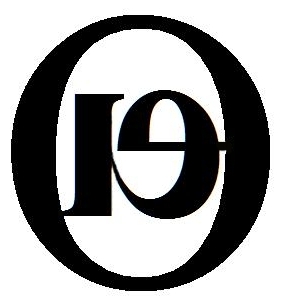
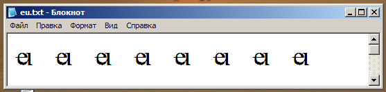
Igor, the problem I have with these is that it looks like "ei" or "el" and definitely not "eu".
72. Re: Euphoria Logo Contest, will you participate?
- Posted by kinz Sep 16, 2009
- 84825 views
Igor, the problem I have with these is that it looks like "ei" or "el" and definitely not "eu".
OK, it is a good thing!
It looks strange and generates the questions for the first time at least. Any reader asks - what a hell, looks like 'i' but where is that dot, looks like 'l' but why so low?
See please one more picture:
It is the Times New Roman font.
Do you see the diffs more clearly now?
And this strangeness is some common thing for really new logo.
See for example the Sun logo, it requires some thinking to see that its icon consists of 4 "sun" words.

Regards,
kinz
73. Re: Euphoria Logo Contest, will you participate?
- Posted by jeremy (admin) Sep 16, 2009
- 84837 views
Igor, the problem I have with these is that it looks like "ei" or "el" and definitely not "eu".
OK, it is a good thing!
It looks strange and generates the questions for the first time at least. Any reader asks - what a hell, looks like 'i' but where is that dot, looks like 'l' but why so low?
See please one more picture:
It is the Times New Roman font.
Do you see the diffs more clearly now?
And this strangeness is some common thing for really new logo.
See for example the Sun logo, it requires some thinking to see that its icon consists of 4 "sun" words.
I don't get at all what you are trying to say that eu looking like an I or L is a good thing. Of course in a different font, not smashed together they don't look the same.
I agree with Derek 100%, it's way too confusing and very hard to see what it's even saying. The Sun logo, you can clearly and easily see Sun 4 times. There is not difficulty in reading it.
Jeremy
74. Re: Euphoria Logo Contest, will you participate?
- Posted by euphoric (admin) Sep 16, 2009
- 84773 views
I think if you look at #53, you can better tell what Igor's going for. You can make out the 'u' by imagining the 'e' is part of it. They're kind of blended together.
While I appreciate the idea, its execution just isn't there yet.
75. Re: Euphoria Logo Contest, will you participate?
- Posted by kinz Sep 16, 2009
- 84773 views
Igor, the problem I have with these is that it looks like "ei" or "el" and definitely not "eu".
OK, it is a good thing!
It looks strange and generates the questions for the first time at least. Any reader asks - what a hell, looks like 'i' but where is that dot, looks like 'l' but why so low?
See please one more picture:
It is the Times New Roman font.
Do you see the diffs more clearly now?
And this strangeness is some common thing for really new logo.
See for example the Sun logo, it requires some thinking to see that its icon consists of 4 "sun" words.
I don't get at all what you are trying to say that eu looking like an I or L is a good thing.
Not 'eu', but the 'u'-portion of the combined new proposed character looks like 'i' without dot, or like too low 'l'.
No, that portion is not i-without-dot, nor too-low-l.
See? It is a portion of 'u'. Nothing more.
But these features make some sense as some little enigma in logo.
Of course in a different font, not smashed together they don't look the same.
Yes, and we have some very strange fonts, for example, EmporiumCapitals, First Order, Pseudo Saudi, Rustic_Capitals, Universal Jack etc etc etc.
I agree with Derek 100%, it's way too confusing and very hard to see what it's even saying.
He-he-he, Derek doesn't say "it's way too confusing and very hard to see what it's even saying".
I see, you do not like my proposition, what to do, but now, with all proposed logos in this topic, you can make tons of skins for your site and switch them on randomly every time the user visits your site again.
The Sun logo, you can clearly and easily see Sun 4 times. There is not difficulty in reading it.
No, I could not to see these suns first time. But now I do see these 4 suns and think it is an interesting icon.
Regards,
kinz
76. Re: Euphoria Logo Contest, will you participate?
- Posted by jeremy (admin) Sep 16, 2009
- 84783 views
I agree with Derek 100%, it's way too confusing and very hard to see what it's even saying.
He-he-he, Derek doesn't say "it's way too confusing and very hard to see what it's even saying".
He does say it looks like different things: ""ei" or "el" and definitely not "eu"" which to me means it's hard and confusing to see what it's actually trying to say.
Jeremy
77. Re: Euphoria Logo Contest, will you participate?
- Posted by DerekParnell (admin) Sep 16, 2009
- 84767 views
- Last edited Sep 30, 2009
WARNING I'm not a graphic artist
As an amateur I submit these two logo ideas.
| Mode | Image |
|---|---|
| Color |  |
| Gray scale |  |
78. Re: Euphoria Logo Contest, will you participate?
- Posted by DerekParnell (admin) Sep 16, 2009
- 84738 views
WARNING I'm not a graphic artist
And here is an icon idea ...
79. Re: Euphoria Logo Contest, will you participate?
- Posted by kinz Sep 16, 2009
- 84785 views
WARNING I'm not a graphic artist
As an amatuer I submit these two logo ideas.
| In Color | |
| In Gray scale | |
Derek, in the GIMP editor, there is separate mode of Logos, in the File menu. It has tons of themes and modes of every theme.
See an example please, in a second or two it generated such a logo:
Try please that mode of GIMP, maybe it is exactly what you need as an amateur.
Regards,
kinz
80. Re: Euphoria Logo Contest, will you participate?
- Posted by JansekVillaria Sep 17, 2009
- 84682 views
Of all the suggestions the simplicity and clean lines of Greg's idea appeal to me the most.
What font did you use for the writing Greg? I would like to play around with it a bit and see if perhaps I can produce a handtweaked fav ico that would look good at lower resolution.
Jansek
81. Re: Euphoria Logo Contest, will you participate?
- Posted by ghaberek (admin) Sep 17, 2009
- 84695 views
Of all the suggestions the simplicity and clean lines of Greg's idea appeal to me the most.
What font did you use for the writing Greg? I would like to play around with it a bit and see if perhaps I can produce a handtweaked fav ico that would look good at lower resolution.
Just Arial. Blue color is {153,102,204}. Orange is {247,150,70}.
-Greg
82. Re: Euphoria Logo Contest, will you participate?
- Posted by _tom (admin) Sep 17, 2009
- 84668 views


86. Re: Euphoria Logo Contest, will you participate?
- Posted by _tom (admin) Sep 18, 2009
- 84578 views

87. Re: Euphoria Logo Contest, will you participate?
- Posted by jaygade Sep 18, 2009
- 84580 views
I kinda like
It's spacey! Reminds me of Star Trek a little bit (or Langwar? )
But I'm still more partial to
![]()
Lots of good submissions, though! When do we start voting?

89. Re: Euphoria Logo Contest, will you participate?
- Posted by mattlewis (admin) Sep 18, 2009
- 84568 views
But I'm still more partial to
![]()
Lots of good submissions, though! When do we start voting?
Yes, I think this design is my favorite so far. I'm not completely sold on the colors, but I think the idea is good.
Matt
90. Re: Euphoria Logo Contest, will you participate?
- Posted by jeremy (admin) Sep 18, 2009
- 84555 views
But I'm still more partial to
![]()
Do we want to use the word Open ?
Jeremy
92. Re: Euphoria Logo Contest, will you participate?
- Posted by jaygade Sep 18, 2009
- 84572 views
But I'm still more partial to
![]()
Do we want to use the word Open ?
Jeremy
I don't have a preference I don't know about others.
Forked into: Forked: should Euphoria logo use "Open"?
94. Re: Euphoria Logo Contest, will you participate?
- Posted by kinz Sep 18, 2009
- 84580 views
Well, I have eu-sign in my Windows TTF fonts now,
Unicode #E111 and #F005
kinz
96. Re: Euphoria Logo Contest, will you participate?
- Posted by silvercoon Sep 18, 2009
- 84546 views
I don't have any talent for drawing, but here's an idea: a simple thumbs-up.
97. Re: Euphoria Logo Contest, will you participate?
- Posted by jacques_desch Sep 18, 2009
- 84539 views
How do you insert image in your post?
Jacques
98. Re: Euphoria Logo Contest, will you participate?
- Posted by _tom (admin) Sep 18, 2009
- 84576 views
{E{_}}
Upload an image to a site like www.imagehost.org
Enter their hotlink between braces
{{ http://h.imagehost.org/0372/brace2.png }}
image appears...

99. Re: Euphoria Logo Contest, will you participate?
- Posted by jacques_desch Sep 18, 2009
- 84530 views
Thanks Tom
Ok here my 3 prefered ones
First choice  Need color improvement
second choice  need color improvement
third choice ![]()
this orange as replacement to choice one and 2 this blue as replacement for the big O in example 1
What about this (an eye) 
Jacques
100. Re: Euphoria Logo Contest, will you participate?
- Posted by Critic Sep 18, 2009
- 84511 views
What about this (an eye)
Creepy. Still plenty of room left for disimprovements, though.
101. Re: Euphoria Logo Contest, will you participate?
- Posted by kinz Sep 18, 2009
- 84483 views
Rob likes this one very much, yes, Rob?
kinz
102. Re: Euphoria Logo Contest, will you participate?
- Posted by kinz Sep 20, 2009
- 84431 views
![]()
Well, I think we need to change our slogan, instead of
"Just say NO to complicated programming languages!" we
should use
"Just say YES to simple programming!"
Any war is bad, Language War too
Then, this picture may be mapped to open on-click pages with short explanations of the flag-icons, Eu operators, the 'EUPHORIA' abbreviation etc.
kinz
103. Re: Euphoria Logo Contest, will you participate?
- Posted by ghaberek (admin) Sep 20, 2009
- 84300 views
- Last edited Sep 21, 2009
But I'm still more partial to
![]()
Do we want to use the word Open ?
Jeremy
How's this?
![]()
-Greg
104. Re: Euphoria Logo Contest, will you participate?
- Posted by Mike777b Sep 20, 2009
- 84297 views
- Last edited Sep 21, 2009
Greg, what would that look like if you made the o, the p and the n of open the same color but changed the e to the color of euphoria and then dropped the e of eupohoria? I'd like to just see what that looks like.
105. Re: Euphoria Logo Contest, will you participate?
- Posted by _tom (admin) Sep 23, 2009
- 84240 views

106. Re: Euphoria Logo Contest, will you participate?
- Posted by _tom (admin) Sep 24, 2009
- 84157 views

107. Re: Euphoria Logo Contest, will you participate?
- Posted by _tom (admin) Sep 25, 2009
- 84102 views
The existing "e" languages have logos that look like this:

108. Re: Euphoria Logo Contest, will you participate?
- Posted by jacques_desch Sep 25, 2009
- 84108 views
The existing "e" languages have logos that look like this:
I prefer last one with circle.
Jacques
109. Re: Euphoria Logo Contest, will you participate?
- Posted by Fendaril Sep 25, 2009
- 84052 views
The existing "e" languages have logos that look like this:
I prefer last one with circle.
Jacques
the last one with the circle minus the caps lock :0
110. Re: Euphoria Logo Contest, will you participate?
- Posted by kinz Sep 27, 2009
- 79990 views


These new ones are made useing the Hommage A Escher font
(author of font is Tibor Lantos, CC license). That font
consists (for now) just of low case Latin letters.
kinz
111. Re: Euphoria Logo Contest, will you participate?
- Posted by jeremy (admin) Sep 27, 2009
- 73606 views
These new ones are made useing the Hommage A Escher font
(author of font is Tibor Lantos, CC license). That font
consists (for now) just of low case Latin letters.
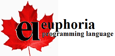
Euphoria is not Canadian any longer, it's open source and global. I don't think it should have a leaf.
Jeremy
Forked into: Canadian Euphoria
112. Re: Euphoria Logo Contest, will you participate?
- Posted by kinz Sep 27, 2009
- 73532 views
These new ones are made useing the Hommage A Escher font
(author of font is Tibor Lantos, CC license). That font
consists (for now) just of low case Latin letters.
Euphoria is not Canadian any longer, it's open source and global. I don't think it should have a leaf.
Jeremy
That leaf is just a nice thing, with Canada flag or without Canada flag, maple is almost a global tree, so it is just a happy case that Rob lives in Canada, which has so beautiful flag.
Why not the maple leaf for a global EU logo?
There are two different leafs in my projects - of Canadian maple and of European maple, see please again - the first one is European one
Regards,
kinz

117. Re: Euphoria Logo Contest, will you participate?
- Posted by kinz Sep 28, 2009
- 73365 views

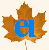
One maple leaf more ...
kinz
118. Re: Euphoria Logo Contest, will you participate?
- Posted by kinz Sep 28, 2009
- 73288 views
Almost old good ...
kinz
119. Re: Euphoria Logo Contest, will you participate?
- Posted by kinz Sep 28, 2009
- 73298 views

And again a maple leaf.
kinz
120. Re: Euphoria Logo Contest, will you participate?
- Posted by ghaberek (admin) Sep 28, 2009
- 73270 views
Kinz, you seem fixated on that logo, yet I can't get over the fact that it looks like "ei" not "eu". I keep thinking to myself, "what is this 'ei' language?"
-Greg
121. Re: Euphoria Logo Contest, will you participate?
- Posted by useless Sep 28, 2009
- 73315 views
One maple leaf more ...
kinz
Someone hasto say it:
some of these maple leaves look like marijuana, just with more lobes, praps a new variant.
useless
122. Re: Euphoria Logo Contest, will you participate?
- Posted by Fendaril Sep 28, 2009
- 73280 views
One maple leaf more ...
kinz
Someone hasto say it:
some of these maple leaves look like marijuana, just with more lobes, praps a new variant.
useless
That was just mean Kat.
123. Re: Euphoria Logo Contest, will you participate?
- Posted by kinz Sep 28, 2009
- 73300 views
Kinz, you seem fixated on that logo,
Yes, I think it is not that bad idea to combine 'e' and 'u' to some single new character and I just am trying the different variants of such a combination.
Same as you are trying the {} idea.
yet I can't get over the fact that it looks like "ei" not "eu".
Strange, it doesn't have that dot on top, do you see?
I keep thinking to myself, "what is this 'ei' language?"
I've explained already that it is the 'eu' language, and you can not remember it is 'eu' ???
Strange again ... Sorry ...
Regards,
kinz
124. Re: Euphoria Logo Contest, will you participate?
- Posted by kinz Sep 28, 2009
- 73279 views
One maple leaf more ...
Someone hasto say it:
some of these maple leaves look like marijuana, just with more lobes, praps a new variant.
Maybe, I just did not see marijuana, never, I'm 63 now.
I've googled marijuana, cannabis, the cannabis leafs are only green, and, yes, they have something similar to that maple ...
Regards,
kinz
125. Re: Euphoria Logo Contest, will you participate?
- Posted by ghaberek (admin) Sep 28, 2009
- 39837 views
This is the Palace Script MT font. I've typed "ei" and "eu" for comparison. Clearly, the "ei" matches the logo you've come up with.
-Greg
126. Re: Euphoria Logo Contest, will you participate?
- Posted by euphoric (admin) Sep 28, 2009
- 39768 views
46000+ views! LOL
This thread is ridiculous!
127. Re: Euphoria Logo Contest, will you participate?
- Posted by jimcbrown (admin) Sep 28, 2009
- 39796 views
This is the Palace Script MT font. I've typed "ei" and "eu" for comparison. Clearly, the "ei" matches the logo you've come up with.
-Greg
He's already explained. It is neither an ei or an eu, but rather a new letter/symbol that uniquely represents euphoria. It is formed by overlapping the 'c' curve of the letter e in eu with the first half of the letter u.
Now, a lot of people have complained that this new letter looks more like ei than eu. I thought otherwise before (in new roman font the new letter looks more like an overlapping e and u to me than the letters e and i next to each other), but your Palace Script MT font is starting to convince me otherwise. In that font, ei looks a lot more like the symbol than I feel comfortable with...
128. Re: Euphoria Logo Contest, will you participate?
- Posted by jacques_desch Sep 28, 2009
- 39744 views
One maple leaf more ...
kinz
Someone hasto say it:
some of these maple leaves look like marijuana, just with more lobes, praps a new variant.
useless
I always suspected that the language was name "euphoria" because of use or abuse of marijuana.
Jacques
129. Re: Euphoria Logo Contest, will you participate?
- Posted by DerekParnell (admin) Sep 28, 2009
- 39737 views
He's [Igor] already explained. It is neither an ei or an eu, but rather a new letter/symbol that uniquely represents euphoria. It is formed by overlapping the 'c' curve of the letter e in eu with the first half of the letter u.
Yes, we get it. However, in spite of knowing how the symbol was derived and regardless of which font is used, it still has a high visual similarity to a cursive "ei". I know it is not "ei" and I know it has not got a dot above the right-most stroke, but it still looks like it. And on that basis alone, I feel that it is just too ambiguous to be used as a symbol to represent the Euphoria Programming language.
130. Re: Euphoria Logo Contest, will you participate?
- Posted by jimcbrown (admin) Sep 28, 2009
- 39788 views
- Last edited Sep 29, 2009
Yes, we get it. However, in spite of knowing how the symbol was derived and regardless of which font is used, it still has a high visual similarity to a cursive "ei". I know it is not "ei" and I know it has not got a dot above the right-most stroke, but it still looks like it. And on that basis alone, I feel that it is just too ambiguous to be used as a symbol to represent the Euphoria Programming language.
Yes, I already said this.
131. Re: Euphoria Logo Contest, will you participate?
- Posted by _tom (admin) Sep 28, 2009
- 39778 views
- Last edited Sep 29, 2009

132. Re: Euphoria Logo Contest, will you participate?
- Posted by useless Sep 28, 2009
- 39732 views
- Last edited Sep 29, 2009
I rather like the middle one, is it possible to shorten the word "programming" by a couple sylables? If not, then i prefer 1 and 2. Mostly 1 without the "Open".
useless
133. Re: Euphoria Logo Contest, will you participate?
- Posted by useless Sep 28, 2009
- 39745 views
- Last edited Sep 29, 2009
I rather like the middle one, is it possible to shorten the word "programming" by a couple sylables? If not, then i prefer 1 and 2. Mostly 1 without the "Open".
useless
134. Re: Euphoria Logo Contest, will you participate?
- Posted by euphoric (admin) Sep 28, 2009
- 39743 views
- Last edited Sep 29, 2009
_tom, these look interesting. How about not making one bracket bold? And see how you can imagine a face in profile inside the bracket? That would be a cool effect if the two braces could be faces.
135. Re: Euphoria Logo Contest, will you participate?
- Posted by kinz Sep 29, 2009
- 39792 views
This is the Palace Script MT font. I've typed "ei" and "eu" for comparison. Clearly, the "ei" matches the logo you've come up with.
Greg, we have the famous English wording:
"Dot the i's and cross the t's !"
Sorry, your 'eu' looks like not dotted 'eii' -
Let's better see my new pictures:
Do you see the curly brackets sums?
Do you see the other brackets sums?
That curly thing is just rarest one in EU,
and why it is a logo ???????
Regards,
kinz
136. Re: Euphoria Logo Contest, will you participate?
- Posted by DerekParnell (admin) Sep 29, 2009
- 39721 views
That curly thing is just rarest one in EU,
and why it is a logo ???????
Because it represents one of the defining things about Euphoria - the sequence.
137. Re: Euphoria Logo Contest, will you participate?
- Posted by jacques_desch Sep 29, 2009
- 39692 views
I rather like the middle one, is it possible to shorten the word "programming" by a couple sylables? If not, then i prefer 1 and 2. Mostly 1 without the "Open".
useless
The last one is my prefered.
Jacques
P.S. where euphoric sees faces profiles I see birds.
138. Re: Euphoria Logo Contest, will you participate?
- Posted by kinz Sep 29, 2009
- 39711 views

Just for better understanding... kinz
139. Re: Euphoria Logo Contest, will you participate?
- Posted by DerekParnell (admin) Sep 29, 2009
- 39691 views
Just for better understanding...
You do read English, right? Good ... it looks like you forgot to dot the 'i'.
I know you haven't, but that's what it looks like!
140. Re: Euphoria Logo Contest, will you participate?
- Posted by jeremy (admin) Sep 29, 2009
- 39701 views
Just for better understanding...
You do read English, right? Good ... it looks like you forgot to dot the 'i'.
I know you haven't, but that's what it looks like!
I agree with Derek, the current trend of your logos looks like ei, not eu. Forget about what it really is, what it looks like is ei. The problem is that it is a mistake either way. The tail end is not a u, therefore, the reader is going to transpose in their mind what it really should be. They will think: is it more likely that the dot is missing from the i or that another underneath curve was forgotten by the writer? In a split second, everyone who reads English on a daily basis will decide the dot is missing from the i. Therefore, they will read the logo as EI, not EU.
Jeremy
141. Re: Euphoria Logo Contest, will you participate?
- Posted by kinz Sep 29, 2009
- 39725 views
That curly thing is just rarest one in EU,
and why it is a logo ???????
Because it represents one of the defining things about Euphoria - the sequence.
Let's see the docs:
 -icon filename[.ico]- (bindw only) When you bind a program, you can patch in
                       your own customized icon, overwriting the one in
                       exw.exe. exw.exe contains a 32x32 icon using 256 colors.
                       It resembles an E) shape.
Do you see, that the EU icon is "an E) shape"?
And this bracket is the most common for EU on the whole.
So the curly brackets are good, but they do not represent EU
well enough, I think.
Regards,
kinz
142. Re: Euphoria Logo Contest, will you participate?
- Posted by kinz Sep 29, 2009
- 39657 views
Just for better understanding...
You do read English, right? Good ... it looks like you forgot to dot the 'i'.
I know you haven't, but that's what it looks like!
I agree with Derek, the current trend of your logos looks like ei, not eu. Forget about what it really is, what it looks like is ei. The problem is that it is a mistake either way. The tail end is not a u, therefore, the reader is going to transpose in their mind what it really should be. They will think: is it more likely that the dot is missing from the i or that another underneath curve was forgotten by the writer? In a split second, everyone who reads English on a daily basis will decide the dot is missing from the i. Therefore, they will read the logo as EI, not EU.
Jeremy
Hey, gentlemen, I just can not imagine a reader, who will
read the official logo and think that it is just not dotted
'i', error, bug, mistake, crap, shit and so on.
Do not keep your readers as idiots, please.
Most of readers just think - what is this new thing - and then
ask or search for explanation.
And any logo requires some explanation, you are right.
The {} thing too, BTW.
Regards,
kinz
143. Re: Euphoria Logo Contest, will you participate?
- Posted by jeremy (admin) Sep 29, 2009
- 39703 views
Let's see the docs:
 -icon filename[.ico]- (bindw only) When you bind a program, you can patch in
                       your own customized icon, overwriting the one in
                       exw.exe. exw.exe contains a 32x32 icon using 256 colors.
                       It resembles an E) shape.
Do you see, that the EU icon is "an E) shape"?
And this bracket is the most common for EU on the whole.
The ) was representing the rainbow, not a ). ) may be the most common however a comma is probably right up there as well. In fact, probably the most common is a space or tab. Actually, it's probably a e or i character but this is not at all the point!
So the curly brackets are good, but they do not represent EU
well enough, I think.
Huh? The major language defining attribute about Euphoria is the sequence! How do you write a sequence? { }. Thus, { and } are the language defining character of Euphoria. Not a paren, comma i or e.
Jeremy
144. Re: Euphoria Logo Contest, will you participate?
- Posted by kinz Sep 29, 2009
- 39675 views
So the curly brackets are good, but they do not represent EU
well enough, I think.
Huh? The major language defining attribute about Euphoria is the sequence! How do you write a sequence? { }. Thus, { and } are the language defining character of Euphoria. Not a paren, comma i or e.
Try please:
sequence a
a = repeat(0,0)
? a
Without curly brackets.
Regards,
kinz
145. Re: Euphoria Logo Contest, will you participate?
- Posted by jimcbrown (admin) Sep 29, 2009
- 39687 views
So the curly brackets are good, but they do not represent EU
well enough, I think.
Huh? The major language defining attribute about Euphoria is the sequence! How do you write a sequence? { }. Thus, { and } are the language defining character of Euphoria. Not a paren, comma i or e.
Try please:
sequence a
a = repeat(0,0)
? a
Without curly brackets.
Regards,
kinz
Wrong. That outputs the curly brackets.
{}
146. Re: Euphoria Logo Contest, will you participate?
- Posted by kinz Sep 29, 2009
- 39615 views
So the curly brackets are good, but they do not represent EU
well enough, I think.
Huh? The major language defining attribute about Euphoria is the sequence! How do you write a sequence? { }. Thus, { and } are the language defining character of Euphoria. Not a paren, comma i or e.
Try please:
sequence a
a = repeat(0,0)
? a
Without curly brackets.
Wrong. That outputs the curly brackets.
{}
He-he, good catch, but Jeremy asked how to write, not output, see please once more his quote.
147. Re: Euphoria Logo Contest, will you participate?
- Posted by jimcbrown (admin) Sep 29, 2009
- 39627 views
He-he, good catch, but Jeremy asked how to write, not output, see please once more his quote.
Yes, we can write sequences, and do everything we need to using sequences, without using curly brackets. It is possible, it is simple, sequences do not require the use of { or }.
But a simple ? will always remind us, no matter how well we try to hide it, that {} is the symbol of the sequence.
148. Re: Euphoria Logo Contest, will you participate?
- Posted by jeremy (admin) Sep 29, 2009
- 39627 views
Try please:
sequence a
a = repeat(0,0)
? a
Without curly brackets.
Of course there are hundreds of ways of constructing a sequence but the fundamental way of making a sequence is { }. ( and ) are common to thousands of languages as token divisors, the same as in Euphoria. ( and ) do not define Euphoria any more than the equal sign does, but I think I have given up on getting anywhere with this debate, sorry.
Jeremy
149. Re: Euphoria Logo Contest, will you participate?
- Posted by jimcbrown (admin) Sep 29, 2009
- 39648 views
Of course there are hundreds of ways of constructing a sequence but the fundamental way of making a sequence is { }.
Jeremy
As distinct from "", which also creates an empty sequence in practice, but conceptually represents the empty string (and the class of strings in general) rather than the empty sequence and class of all sequences.
150. Re: Euphoria Logo Contest, will you participate?
- Posted by _tom (admin) Sep 30, 2009
- 7724 views
Not to say that the {} theme is the ultimate, but Inkscape is fun.

151. Re: Euphoria Logo Contest, will you participate?
- Posted by jacques_desch Sep 30, 2009
- 7735 views
Not to say that the {} theme is the ultimate, but Inkscape is fun.
Very nice one _tom
Jacques
152. Re: Euphoria Logo Contest, will you participate?
- Posted by useless Sep 30, 2009
- 7725 views
Not to say that the {} theme is the ultimate, but Inkscape is fun.
That looks like a page i'd read down on a bit!
useless
153. Re: Euphoria Logo Contest, will you participate?
- Posted by kinz Oct 01, 2009
- 7708 views
And pure Russian version:

Let's see once more the very first readme.doc:
			---------------------
			    Euphoria 1.0
			Public Domain Edition
			---------------------

 Welcome to Euphoria! ... End User Programming with Hierarchical Objects
			  for Robust Interpreted Applications

 Euphoria is a new programming language developed by Rapid Deployment Software,
 a Canadian software research and development firm.

 Euphoria is primarily a language for =End User's= like yourself. These are
 people who want to develop software for their own use. They want fast ...
=End User's= like yourself, RDS wants you as user of their language, first of all.
Let's give them 'you'-sign for their language. There is a free font editor in Windows, eudcedit command, it adds new signs to TTF fonts. It is just for our needs. See this command once more. EUdCedit - End User's different Characters. Combined 'e' and 'u' sounds as 'you', same in Russian mirrored version.
Cool, no ?
Regards,
kinz
154. Re: Euphoria Logo Contest, will you participate?
- Posted by kinz Oct 01, 2009
- 7686 views
P.S. where euphoric sees faces profiles I see birds.
With my poor imagination of a retired submariner I see tits, carramba 
155. Re: Euphoria Logo Contest, will you participate?
- Posted by _tom (admin) Oct 01, 2009
- 7666 views

Что такое Euphoria?
Euphoria is a simple, flexible, and easy-to-learn programming language. It lets you quickly and easily develop programs ...
The features that make it easy.
- consistent syntax
- generic
- using the same generic constructs for numbers and text is a grand simplification
- easy to read blocks of code
- for my eyes "end keyword" is simpler than indentation, () groupings, {} groupings, and the need for ; and . line demarcations.
- one based indexing
- reduces "off by one" errors
- no need to declare datatypes
- I know 'a', 97, and 97.0 are different mathematically, and for computers; but I usually don't care when I am programming
- the sequence lets you organize any data
- without the need for a datatype or structure for every nuance of organization
- no need for manual effort to control memory storage and garbage collection
- OOP is fascinating, but it gets in the way of simple programming
- easier GUI
- the wrappers for wxwigets, gtk, IUP, ... , are simpler than the original incarnations
- fast
Many languages are now offering variations of these features. Only Euphoria seems to offer all of them in one package. (Though, I am interested in any updates in the progress of other languages.)
The "one" truly distinctive feature seem to be the sequence. Without it Euphoria would be just another language. With it, it is a language that makes it unique and distinctive from conventional languages. (Again, I am interested if any languages have managed to catch up with Euphoria.)
From this it "follows" that {} is reasonable starting point for the design of a Euphoria logo.
Sugar Maple
Yes, it is Fall, and colourful maple leaves are collecting on my lawn. In Toronto leaves are 'colourful' instead of 'colorful'. And yes, I have collected maple syrup.
Realistic maple leaf based logos are typical of 1950's artwork. Stylized maple leaf logos are current. Foreign corporations often stick a maple in a logo somehow to create a "Canadian" identity. The Canadian government is currently spending 35$ million to advertise (the maple leaf is prominent) how good they are at economic progress--the opposition parties are complaining this is a partisan pre-election ploy.
Unless a maple leaf is on a hockey uniform, many Canadians do not take notice of the maple leaf.
My conclusion is that a maple is not suitable for use in a Euphoria logo.
Cyrillic
The inability of a "westerner" to see "ei" or "ie" as being equivalent to "eu" must be cultural. I can look at the Russian alphabet and I can understand the frustration that is associated with this issue.
Unfortunately, I do not see any variation in artwork that would make a monogram of "e" and "u" work as a logo. (I even looked at Klingon.)
Submarines
I have heard the sound of ship propellers from inside a submarine hull. I will hide behind my expired security clearance and not elaborate.
It is fascinating in how two braces { } can elicit a variety of visual interpretations.
Logo?
What we need now are many variations, from as many people as possible.
For example: I did not think about {} until I saw {eu}phoria.
156. Re: Euphoria Logo Contest, will you participate?
- Posted by kinz Oct 02, 2009
- 7577 views
Let's see some typical C code from EU source:
void RTInternal(char *msg)
// Internal error
{
    RTFatal(msg);
}

--------

or better:
       . . .
	    free(p); /* give it back to malloc arena */
	    cache_size -= 2;
	}
    }
}
Do you see that {} is one of the main odious features of C language? The C style just is based on perpetuale {}, C just can not live without {}.
Why that main feature of C language texts claims to be a EU logo?
I see some call to migrate to C in {} or {} based logos of EU.
In EU, these {} are just sequence-formation operator, just one of different options to write a sequence, mainly simple and short one.
Regards,
kinz
157. Re: Euphoria Logo Contest, will you participate?
- Posted by DerekParnell (admin) Oct 02, 2009
- 7588 views
Do you see that {} is one of the main odious features of C language? The C style just is based on perpetuale {}, C just can not live without {}.
Why that main feature of C language texts claims to be a EU logo?
I see some call to migrate to C in {} or {} based logos of EU.
In EU, these {} are just sequence-formation operator, just one of different options to write a sequence, mainly simple and short one.
Igor,
I understand that you and I think differently about almost everything in the universe, so I acknowledge that this post is really a waste of both our time. However ...
You have it the wrong way around, in my opinion. The sequence is one of the definitive attributes of Euphoria, right? And the {} is the syntax Euphoria uses to write sequence literals and one of the ways to create sequences, right? Thus the {} could be used to represent that special thing (sequences) about Euphoria.
Braces are used in many different languages; mainly to show the lexical scope of a set of statements - e.g. a function, a class, a structure, etc ... Many languages have these constructs and they are not so special to any particular language; even Euphoria has similar constructs. So trying to use braces as an icon for those language is not very clever. But when thinking of Euphoria, the brace makes sense as it could symbolize that special aspect of the language.
Thanks for reading this far I won't be arguing the point with you so there is no need to reply, I just wanted to state that I have a different opinion from yours.
158. Re: Euphoria Logo Contest, will you participate?
- Posted by kinz Oct 02, 2009
- 7573 views
<snipped>
Thanks for reading this far I won't be arguing the point with you so there is no need to reply, I just wanted to state that I have a different opinion from yours.
Derek, thanks, copy.
I've submitted my EU logos to RDS site, feel free to use them or not use for the Open Euphoria projects, programs, sites as you wish.
Regards,
kinz
159. Re: Euphoria Logo Contest, will you participate?
- Posted by jeremy (admin) Oct 02, 2009
- 7584 views
Do you see that {} is one of the main odious features of C language? The C style just is based on perpetuale {}, C just can not live without {}.
You're still failing to see what everyone else is talking about. In C, { } is just a block delimiter, it has no real definition of a killer C feature. In Euphoria { } define sequences which is the defining characteristic of Euphoria. What you are trying to compare is not at all a valid comparison.
Jeremy
160. Re: Euphoria Logo Contest, will you participate?
- Posted by _tom (admin) Oct 02, 2009
- 7627 views
We should still recognize that Igor has made a valid point. There is a class of languages that are called "curly-bracket languages":
http://en.wikipedia.org/wiki/Curly_bracket_programming_language
So we are making a "superior claim" to the use of { } in programming.
It is hard to say if {} will be interpreted as part of these languages or seen a a truly new thing. If we educate the world, they will see it our way.
As to logos, we still need fresh ideas. My creative skills are limited.
161. Re: Euphoria Logo Contest, will you participate?
- Posted by kinz Oct 02, 2009
- 7555 views
Do you see that {} is one of the main odious features of C language? The C style just is based on perpetuale {}, C just can not live without {}.
You're still failing to see what everyone else is talking about. In C, { } is just a block delimiter, it has no real definition of a killer C feature. In Euphoria { } define sequences which is the defining characteristic of Euphoria. What you are trying to compare is not at all a valid comparison.
Jeremy, { killed, as you say, begin of Algol, Pascal etc, and } killed their end. So it is namely C's killer-feature.
So I'm not failing to see what everyone else is talking about, but I have my own opinion on this subject, on {} thing in EU itself and its possible role in EU logo.
{} is good in EU code, but it is not good in EU logo, I think.
Regards,
kinz
162. Re: Euphoria Logo Contest, will you participate?
- Posted by jaygade Oct 02, 2009
- 7512 views
I don't really like {} . I still prefer {eu}phoria.
163. Re: Euphoria Logo Contest, will you participate?
- Posted by kinz Oct 03, 2009
- 7471 views
Unless a maple leaf is on a hockey uniform, many Canadians do not take notice of the maple leaf.
My conclusion is that a maple is not suitable for use in a Euphoria logo.
Tom, but we, Russians, like the maple leafs very much, maple is klyon in Russian:
http://fotki.yandex.ru/search.xml?text=%D0%BA%D0%BB%D0%B5%D0%BD%D0%BE%D0%B2%D1%8B%D0%B9+%D0%BB%D0%B8%D1%81%D1%82&locate_text=
So my conclusion is that a klyon leaf is very good for EU logo.
Regards,
kinz
164. Re: Euphoria Logo Contest, will you participate?
- Posted by kinz Oct 03, 2009
- 7436 views
Klyon really sounds as kl-your-n, kljon. Do you see "your" in Russian maple? Something mystic is in that nice leaf. EU anyway. You-language.
Regards,
kinz
165. Re: Euphoria Logo Contest, will you participate?
- Posted by kinz Oct 03, 2009
- 7477 views
And we have a song about maple leaf, very nice song:
http://www.youtube.com/watch?v=cT-rIpcZCyE&NR=1
Klenovyj (= maple's) list (= leaf)
166. Re: Euphoria Logo Contest, will you participate?
- Posted by kinz Oct 04, 2009
- 7497 views
http://fotki.yandex.ru/top/users/volar70/view/220370
And this one ...
167. Re: Euphoria Logo Contest, will you participate?
- Posted by kinz Oct 04, 2009
- 7453 views
OK, let's try to search Google for new EU logo:
http://www.google.com/search?&q=%22new+letter+eu
Cool, no?
Then try to find 'e', 'eu', 'eup', 'euph' etc themselves.
http://www.google.com/search?&q=%22{eu}phoria
Regards,
kinz
168. Re: Euphoria Logo Contest, will you participate?
- Posted by kinz Oct 04, 2009
- 7423 views
And how to get new EU logos:
http://www.google.com/search?&q=%22new+eu+letter
Regards,
kinz
169. Re: Euphoria Logo Contest, will you participate?
- Posted by jaygade Oct 04, 2009
- 7403 views
OK, let's try to search Google for new EU logo:
http://www.google.com/search?&q=%22new+letter+eu
Cool, no?
Then try to find 'e', 'eu', 'eup', 'euph' etc themselves.
http://www.google.com/search?&q=%22{eu}phoria
Regards,
kinz
Heh. Japanese girl bands are cool. It would be even better if they endorsed Euphoria language...
170. Re: Euphoria Logo Contest, will you participate?
- Posted by kinz Oct 05, 2009
- 7400 views
Heh. Japanese girl bands are cool. It would be even better if they endorsed Euphoria language...
Do not forget that RDS has it's own Japanese first lady
And Canada has it's own sakura trees:
http://en.wikipedia.org/wiki/High_Park
http://en.wikipedia.org/wiki/Cherry_blossom
Let's work on cherry blossom for EU logo
Regards,
kinz
171. Re: Euphoria Logo Contest, will you participate?
- Posted by kinz Oct 05, 2009
- 7402 views
http://www.youtube.com/watch?v=rDjAN8sKb1A
Listen to Perez Prado for now ...
It is one of my favorite melodies, what to do...
Regards,
kinz

174. Re: Euphoria Logo Contest, will you participate?
- Posted by DanM Oct 06, 2009
- 7269 views
I think your flower logo is, in a way, the best looking logo yet.
But it's NOT pronounced "eeeeeeforia", it's "UUUUUforia"! !
You make some WONDERFUL looking logos, but I don't think anyone else here will accept "Ei" (without a "dot") as a replacement or alternative for "Eu".
I know you are enamored by the ability to "transform" your "Ei" into a Russian equivalent to "Eu", but "Ei" is pretty much meaningless to non-Russian (or similar) viewers.
For whatever it's worth, "Ei" just doesn't work at all for Euphoria, in my opinion.
But your flower motif, with {} braces and "Eu" would, I think, be superlative!
Dan
175. Re: Euphoria Logo Contest, will you participate?
- Posted by kinz Oct 10, 2009
- 7026 views
Euphoria was originally developed in Raccoon City, located in Canada. Raccoon City is also known as "Toronto" or "Hog Town", or historically "Muddy York".


This raccoon is from the Moscow Zoo, photo by 14 years old
George Dyukov.
Raccoon is enot in Russian.
Regards,
kinz
176. Re: Euphoria Logo Contest, will you participate?
- Posted by jeremy (admin) Oct 12, 2009
- 6938 views
This raccoon is from the Moscow Zoo, photo by 14 years old
George Dyukov.
Raccoon is enot in Russian.
These are nice but I don't think anyone likes EI, regardless if it really is EU.
Jeremy
177. Re: Euphoria Logo Contest, will you participate?
- Posted by mattlewis (admin) Oct 12, 2009
- 6867 views
These are nice but I don't think anyone likes EI, regardless if it really is EU.
Only when it comes after 'c'.
Matt
178. Re: Euphoria Logo Contest, will you participate?
- Posted by AndyDrummond Oct 20, 2009
- 6297 views
A bit late in the day, I know, but no-one seems to have got anything at all like the Sun logo, which is quite well-known and recognisable. Also, it seems that many of the contributions would not actually be of value as an icon, and I would think that that is one of the main requirements. So how about some variant on this kind of thing? It is recognisable as "eu" anyway!

Clearly there are many variants of this - I have one with a circle round, one with curly braces around, coloured, etc - but this is the basis. Any interest, gentlemen?
179. Re: Euphoria Logo Contest, will you participate?
- Posted by jimcbrown (admin) Oct 20, 2009
- 6301 views
A bit late in the day, I know, but no-one seems to have got anything at all like the Sun logo, which is quite well-known and recognisable. Also, it seems that many of the contributions would not actually be of value as an icon, and I would think that that is one of the main requirements. So how about some variant on this kind of thing? It is recognisable as "eu" anyway!
Clearly there are many variants of this - I have one with a circle round, one with curly braces around, coloured, etc - but this is the basis. Any interest, gentlemen?
I love it!
180. Re: Euphoria Logo Contest, will you participate?
- Posted by jimcbrown (admin) Dec 03, 2010
- 5722 views
- bump*
181. Re: Euphoria Logo Contest, will you participate?
- Posted by jimcbrown (admin) Dec 03, 2010
- 5715 views
4.0 is nearing completion, we really need a logo before that time.
To make sure that we don't lose them, I'm cross-linking all three logo threads along with the powered by euphoria thread.
http://openeuphoria.org/forum/113747.wc http://openeuphoria.org/forum/113748.wc http://openeuphoria.org/forum/113750.wc http://openeuphoria.org/forum/106779.wc http://openeuphoria.org/forum/109632.wc
182. Re: Euphoria Logo Contest, will you participate?
- Posted by coconut Dec 03, 2010
- 5627 views
A starting point...
ugly
183. Re: Euphoria Logo Contest, will you participate?
- Posted by coconut Dec 03, 2010
- 5615 views
Not to say that the {} theme is the ultimate, but Inkscape is fun.
Yes! I very like this one
184. Re: Euphoria Logo Contest, will you participate?
- Posted by DerekParnell (admin) Dec 03, 2010
- 5567 views
Yeah, I like inkscape too.
I came up with these two...
One from ages ago 
And one just a few days ago 
185. Re: Euphoria Logo Contest, will you participate?
- Posted by jeremy (admin) Dec 03, 2010
- 5633 views
Not to say that the {} theme is the ultimate, but Inkscape is fun.
Yes! I very like this one
The one thing w/this is that it may be good for a web banner or something but not for an icon. It would be nice to have something that works for both. I do like the {e} theme created by some. It would lend itself to an icon or a logo.
Jeremy
186. Re: Euphoria Logo Contest, will you participate?
- Posted by smudger Dec 07, 2010
- 5359 views
I hafta say, having read through this thread for the first time toady, that I think (if we are agreed that it needs something like the php or ruby logo), then we should just design something that's simple, elegant, techy and lends itself to being rendered in a variety of ways. I had a play with some ideas, but kept coming back to the braces meme and decided all it needed was a suitable choice of font and colour scheme. So, I offer this for your consideration:

Cheers, smudger
187. Re: Euphoria Logo Contest, will you participate?
- Posted by jeremy (admin) Dec 07, 2010
- 5343 views
smudger, I like those. We should consider also a logo in regards to how we would incorporate it or it's "style" into an icon for .e, .ex and resulting executable files (that do not define their own icon).
Just some more food for thought.
Jeremy
188. Re: Euphoria Logo Contest, will you participate?
- Posted by euphoric (admin) Dec 07, 2010
- 5340 views
...we should just design something that's simple, elegant, techy and lends itself to being rendered in a variety of ways.
smudger, I agree with your design proposal and I think your designs are nice. I wonder if you could make a few revisions for me to view:
- the first one (open{euphoria}) with the word "open" the same color as "euphoria"
- the first one with the color for the text and braces reversed (so the words are gray and the braces are blue)
- the last one with just {e}. I don't like the idea of using "eu" because it's too European Union to me.
Other notes:
- I think the second one could work just fine as a logo, and the icon would be the third one ({e}). We might adopt a mascot, and I've suggested a mongoose. :) Maybe you could put a mongoose around that logo.
- The third one as just {e} would still need to have a basic square dimension, meaning don't bring the braces in just because you remove the 'u'. Icon dimensions are usually square.
Anyhow, good job!
189. Re: Euphoria Logo Contest, will you participate?
- Posted by smudger Dec 07, 2010
- 5320 views
Now you have too much choice!

Cheers,
Smudger
p.s. the general plan if you want to go with the logo is to make it into a font
and then it can be rendered in whatever format/graphics package you want.
190. Re: Euphoria Logo Contest, will you participate?
- Posted by smudger Dec 07, 2010
- 5225 views
Forgot the mongoose 
I notice, that a mongoose standing up is like a curly brace (in the sense of being tall and thin),
so I will work on a graphic tomorrow. Should be simples.
Cheers,
Smudger
191. Re: Euphoria Logo Contest, will you participate?
- Posted by DerekParnell (admin) Dec 07, 2010
- 5232 views
Forgot the mongoose
Are you thinking of a meerkat specifically or one of the other types of mongoose?

192. Re: Euphoria Logo Contest, will you participate?
- Posted by euphoric (admin) Dec 07, 2010
- 5348 views
Are you thinking of a meerkat specifically or one of the other types of mongoose?
193. Re: Euphoria Logo Contest, will you participate?
- Posted by smudger Dec 07, 2010
- 5445 views
I was thinking of a meerkat, yes. I just realised that there are different types of mongoose.
Meerkats are well known in the UK because of a TV series called Meerkat Manor and
a subsequent long-running TV ad campaign for motor insurance comparison called "compare the meerkat".
http://en.wikipedia.org/wiki/meerkat_manor/
http://www.comparethemeerkat.com/
Consequently, the image of a meerkat "standing to attention" has become quite iconic.
Smudger
194. Re: Euphoria Logo Contest, will you participate?
- Posted by DanM Dec 07, 2010
- 5420 views
I was thinking of a meerkat, yes. I just realised that there are different types of mongoose.
Meerkats are well known in the UK because of a TV series called Meerkat Manor and
a subsequent long-running TV ad campaign for motor insurance comparison called "compare the meerkat".
http://en.wikipedia.org/wiki/meerkat_manor/
http://www.comparethemeerkat.com/
Consequently, the image of a meerkat "standing to attention" has become quite iconic.
Smudger
MEERKAT! YES!
Dan
195. Re: Euphoria Logo Contest, will you participate?
- Posted by smudger Dec 08, 2010
- 5201 views

Cheers,
Smudger
196. Re: Euphoria Logo Contest, will you participate?
- Posted by smudger Dec 08, 2010
- 5196 views

Smudge
197. Re: Euphoria Logo Contest, will you participate?
- Posted by jeremy (admin) Dec 08, 2010
- 5137 views
I like both of them, but with a comic character like that would like to see some life in him w/some colors or something?
Jeremy
198. Re: Euphoria Logo Contest, will you participate?
- Posted by smudger Dec 08, 2010
- 5164 views
I like both of them, but with a comic character like that would like to see some life in him w/some colors or something?
Jeremy
OK, thanks for your reply. I would offer the following:
Firstly, It's not a "comic character", this is a comic character (Timon from Lion King):
My offer is a graphic illustration of a meerkat with a carefully balanced mix of bilateral symmetries/asymmetries intended to suggest a "friendly, approachable, techy" vibe.
Most (all?) meerkats are either a mix of greys with black or a mix of sand/beige colours with black.
As far as I can tell, a brand colour scheme has not been agreed, so to keep the colours in line with my current offers for the logo of blue/grey, I rendered the meerkat in grays as sand/beige shades would not be appropriate with steel grey/blue text.
Nothwithstanding the above, colour is a very emotive subject, and as no brand colour scheme has been pre-agreed, it is appropriate (in the first instance) to show the graphic rendered in neutral colours so that people can judge the merits of the graphic without being encumbered by considerations of colour.
Do you have any particular suggestions for a colour scheme?
Regards,
Smudger
199. Re: Euphoria Logo Contest, will you participate?
- Posted by jeremy (admin) Dec 08, 2010
- 5114 views
Do you have any particular suggestions for a colour scheme?
I'm lucky if I can get my pants to match my shirt. Sometimes I'm very lucky and have matching socks as well Me, colors?
Jeremy
200. Re: Euphoria Logo Contest, will you participate?
- Posted by euphoric (admin) Dec 09, 2010
- 5179 views
What about a ferret?
I still like the idea of a mongoose, but if not that, a ferret. They're cuter than meerkats.
201. Re: Euphoria Logo Contest, will you participate?
- Posted by smudger Dec 09, 2010
- 5093 views
Is anyone (or any group) empowered to make a decision?
Is anyone *going* to make a decision?
If a decision is made to adopt a logo and/or mascot, is anyone likely to act on it?
How does the decision making process work? What time scale does it operate on?
I'm just trying to decide whether there is any mileage in me spending any more time working on this.
Regards,
Smudger
202. Re: Euphoria Logo Contest, will you participate?
- Posted by jeremy (admin) Dec 09, 2010
- 5098 views
Is anyone (or any group) empowered to make a decision?
Is anyone *going* to make a decision?
If a decision is made to adopt a logo and/or mascot, is anyone likely to act on it?
How does the decision making process work? What time scale does it operate on?
I'm just trying to decide whether there is any mileage in me spending any more time working on this.
These are all good questions and here is my driving force. Bar any major fault in RC2, 4.0 final will be released Dec 22. With this release I and others are going to being doing all we can do to spread the news of the 4.0 release to the wider programming audience. I would very much like to have a polished site and downloads of 4.0. Right now the site is presentable. The PDF manual needs quite a bit of styling work and I'd love to have our Logo on the cover page. More than all of that, though, our Icon that is distributed with Euphoria is terrible. It's 32x32 only, 256 colors, highly pixelated and a logo that is poorly rendered and no longer makes sense (even if it was well done, which it is not).
For our "rebirth" into the community, I'd like to have this stuff down.
Who has the authority? Ultimately I think it's up to the development team but we always seek community input. This thread, however, has went on for a long time with a wide variety of opinions.
In the end from all sorts of logos and products I have looked at it doesn't seem to matter what the logo is (as long as it's not something offensive or obviously wrong) only that it's well done and consistent.
Let me send an email to the other devs and get their thoughts as what I just wrote is simply my thoughts alone. I'll follow up again shortly.
Jeremy
203. Re: Euphoria Logo Contest, will you participate?
- Posted by smudger Dec 09, 2010
- 5031 views
OK, thanks for that Jeremy.
It's good that there is a deadline! I look forward to your further comments. Can I suggest you take the opportunity to start a new thread?, as this one is responsible for significant bandwidth!
Cheers,
Smudger
204. Re: Euphoria Logo Contest, will you participate?
- Posted by jeremy (admin) Dec 09, 2010
- 4971 views
Is anyone (or any group) empowered to make a decision?
I have a few ideas about this whole process, can you send me an email? jeremy AT cowgar _ com
Jeremy
205. Re: Euphoria Logo Contest, will you participate?
- Posted by _tom (admin) Dec 09, 2010
- 4981 views
Another suggestion:
A meercat should go well with any logo.
(How about a Marmot?)


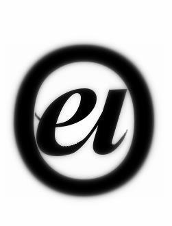