
Re: Euphoria Logo Contest, will you participate?
- Posted by kinz Sep 16, 2009
- 85455 views
DerekParnell said...
Igor, the problem I have with these is that it looks like "ei" or "el" and definitely not "eu".
OK, it is a good thing!
It looks strange and generates the questions for the first time at least. Any reader asks - what a hell, looks like 'i' but where is that dot, looks like 'l' but why so low?
See please one more picture:
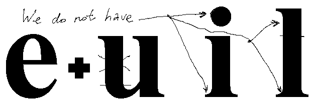
It is the Times New Roman font.
Do you see the diffs more clearly now?
And this strangeness is some common thing for really new logo.
See for example the Sun logo, it requires some thinking to see that its icon consists of 4 "sun" words.

Regards,
kinz

