1. favicon.ico
- Posted by ne1uno Sep 16, 2009
- 6430 views
Forked from Re: Euphoria Logo Contest, will you participate?
I really liked the professional appearance of the others and the use of { } in the logo, as it shows some Euphoria code.
How is this?
[...]
As an icon:

can you convert to ico and try it out?
<link rel="shortcut icon" href="/favicon.ico">
I think that gets added to the main page, but it may not be required, most browsers probably look for one by default.
2. Re: favicon.ico
- Posted by ne1uno Sep 16, 2009
- 6420 views
forgot to mention before any choice is made, eu being generally accepted abreiv. for European Union, are there any implications down the road preventing eu as a trademark or even casual usage in an icon? not the easiest thing to search for. they have plenty of lawyers and tend to win. the publicity couldn't hurt but a fine would.
3. Re: favicon.ico
- Posted by DerekParnell (admin) Sep 16, 2009
- 6415 views
As an icon:

I think the shadow effect needs to be removed from this icon image as it just looks blurry otherwise.
4. Re: favicon.ico
- Posted by DerekParnell (admin) Sep 16, 2009
- 6433 views
forgot to mention before any choice is made, eu being generally accepted abreiv. for European Union ...
I'm pretty sure that the European Union abbreviation is EU - all caps, the its Internet TLD is "eu", but that is not a trademark.
5. Re: favicon.ico
- Posted by ghaberek (admin) Sep 16, 2009
- 6527 views
As an icon:

I think the shadow effect needs to be removed from this icon image as it just looks blurry otherwise.
You're probably right. 
-Greg
6. Re: favicon.ico
- Posted by kinz Sep 16, 2009
- 6406 views
As an icon:

I think the shadow effect needs to be removed from this icon image as it just looks blurry otherwise.
You're probably right. 
You both seem to be wrong, see please a fragment of my desctop:

Regards,
kinz
7. Re: favicon.ico
- Posted by ghaberek (admin) Sep 16, 2009
- 6363 views
You both seem to be wrong, see please a fragment of my desctop:

Regards,
kinz
I don't understand what you're getting at. Should I keep or remove the drop shadow? Should I add a black border to the icon?
-Greg
8. Re: favicon.ico
- Posted by jeremy (admin) Sep 16, 2009
- 6334 views
You both seem to be wrong, see please a fragment of my desctop:

Not to keep picking, but your icon on the desktop even looks like a fancy @ symbol.
Jeremy
9. Re: favicon.ico
- Posted by kinz Sep 16, 2009
- 6326 views
You both seem to be wrong, see please a fragment of my desctop:

Regards,
kinz
I don't understand what you're getting at. Should I keep or remove the drop shadow? Should I add a black border to the icon?
See please the zoommed fragment:

I do not have an idea about what do you do at all and why it is so blurred.
Regards,
kinz
10. Re: favicon.ico
- Posted by ghaberek (admin) Sep 16, 2009
- 6324 views
See please the zoommed fragment:

I do not have an idea about what do you do at all and why it is so blurred.
I see now. That's because it's only a 16x16 icon. There is no larger 32x32 counterpart, so the 16x16 icon is getting "blown up" by Windows to fill a 32x32 area. I can add a clearer 32x32 image to the icon. I was only using a 16x16 image for testing, as that's all that is required for a favicon.
-Greg
11. Re: favicon.ico
- Posted by DerekParnell (admin) Sep 16, 2009
- 6322 views
I see now. That's because it's only a 16x16 icon...
Additionally, make sure small images like icons don't use anti-aliasing as this can (but not always) increase the blurred effect.
12. Re: favicon.ico
- Posted by ghaberek (admin) Sep 16, 2009
- 6307 views
Additionally, make sure small images like icons don't use anti-aliasing as this can (but not always) increase the blurred effect.
Thanks, I'll do that.
-Greg
13. Re: favicon.ico
- Posted by kinz Sep 16, 2009
- 6315 views
See please the zoommed fragment:

I do not have an idea about what do you do at all and why it is so blurred.
I see now. That's because it's only a 16x16 icon. There is no larger 32x32 counterpart, so the 16x16 icon is getting "blown up" by Windows to fill a 32x32 area. I can add a clearer 32x32 image to the icon. I was only using a 16x16 image for testing, as that's all that is required for a favicon.
See please some good favicon:

Plus zoommed:
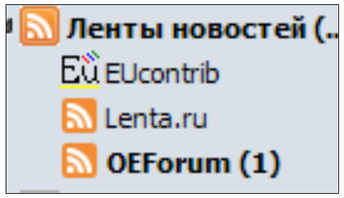
Regards,
kinz
14. Re: favicon.ico
- Posted by kinz Sep 16, 2009
- 6398 views
See please the zoommed fragment:

I do not have an idea about what do you do at all and why it is so blurred.
I see now. That's because it's only a 16x16 icon. There is no larger 32x32 counterpart, so the 16x16 icon is getting "blown up" by Windows to fill a 32x32 area. I can add a clearer 32x32 image to the icon. I was only using a 16x16 image for testing, as that's all that is required for a favicon.
See please our icons in pure 16x16 format on Windows:
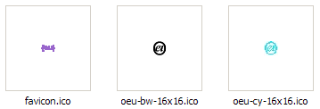
Do you see favicon.ico is very strange anyway?
Regards,
kinz


